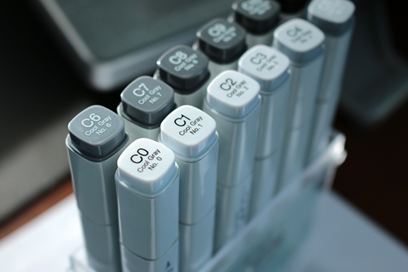
“Rumors of my demise are greatly over exaggerated” is not only a famous quote (Mark Twain) and song lyric (Rise Against the Machine), it also accurately describes the state of markers as a tool in the product development and design industry. Long gone are the days when painstaking hours were spent on full color, hand-drawn marker renderings (thank goodness!). However, I propose marker usefulness on a daily basis has not diminished. Here are just five reasons to not write off this somewhat archaic technology:
- Intentionally Imprecise: A chisel or wide
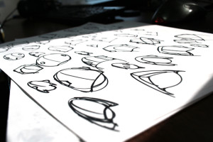 tipped sharpie is a great tool for quickly exploring a basic overall shape without getting caught up in details that aren’t yet pertinent. Our industry is detail oriented, and yet large markers can force you to be intentionally vague, work quickly, redirect focus to the 10,000 ft. view, cover ground and experiment with very few consequences. Fail quick, fail often and move forward more informed.
- Line Weight: This single attribute is often
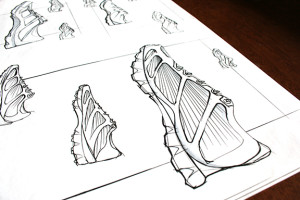 what separates a great looking sketch from a less successful version. Thickness of lines is one of the quickest methods to show depth: is the line the closest one to the ground? Thick. Is the line a significant edge not attached to the bottom? Medium. Is the line an interior or contour line? Thin. Yeah, there are nuances to these rules, but if you’re not already using them, these simple guidelines will take your sketches to a whole new level. One thin pen, one medium, and one thick marker and you are in business.
- Depth: Low fidelity sketches are generally the next step after loose thumbnails. Photoshop brushes and masking can absolutely get the job done well, but they also require scanning your linework, color balancing etc. If getting the basic surfacing ideas across quickly is the most important goal, then contour lines are useful, but can quickly become distracting. By contrast, two gray scale markers in different values (20% and 50%, or 30% and 60%) can quickly add significant depth to any linework in less time than it would take to even prepare a file for digital shading.
- Color Exploration: There’s no need to own
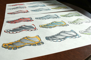 a 72 pack with 7 shades of orange, but a basic 12 color set can be very handy to have on your desk. Say you’re are working on a water bottle and already have the general shape worked out in analog or digital formats… Scan the original sketch, duplicate, arrange in neat organized rows, and print it out. What does it look like in blue? How does a green grip affect the overall value or impact? You are only seconds away from finding out! This process is a great tool for building consensus at a design review, as everyone can quickly have a say, and there’s less “what if” conjecturing.
- Simplicity: Have you ever tried to drag
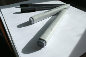 a giant drawing tablet or computer to the airport, on a bus, or even home from work in the evening? While being amazing tools, portability is a distinct drawback. Digital sketching and rendering absolutely have their advantages, but when I can grab some pens, markers and paper, sit down on a flat surface – anywhere in the world – and problem solve a design that others can visually understand in minutes, that’s a distinct advantage, and a force to be reckoned with.
Although the tools of product design continue to evolve in this increasingly digital world, don’t shelve those Prismacolor or Copic markers just yet. You may never do a 6 hour rendering by hand again in your life, but don’t dismiss an incredibly useful tool entirely just because it’s a little antiquated. If nothing else, at the end of the day, analog tools will never run out of battery power…. which is more than we can say about too many products in our daily lives.
Kirk Turner is an Industrial Designer, and has been bringing his brand of expertise to the Salient Team since 2015.

